
Edge UX Optimization
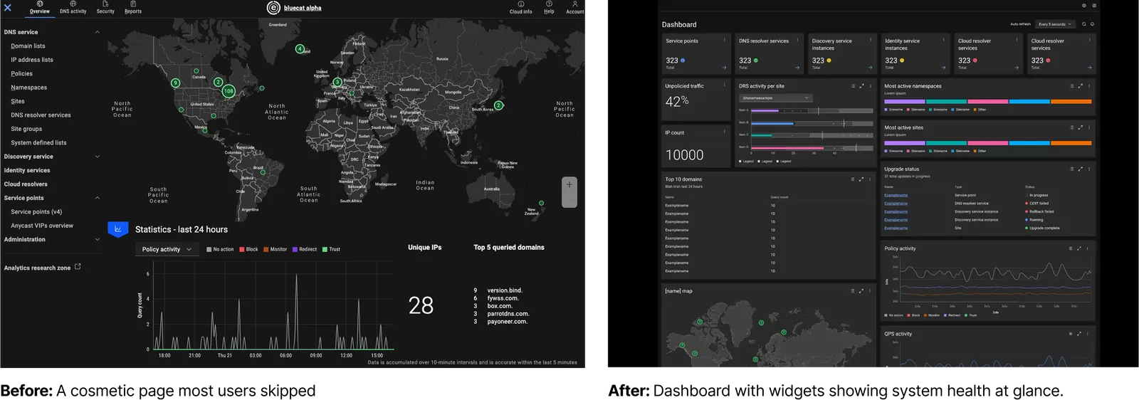
Imagine opening Netflix and first thing you see is your watchlist, but that’s it — no buttons, no actions, just posters to look at. That’s what Edge’s overview page felt like to it’s users: nice to look at, but not useful when you actually needed to get something done.
Problem Statement
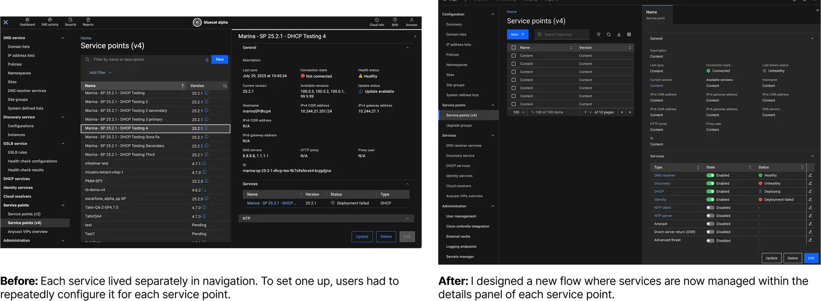
Customers described Edge as complicated and difficult to navigate. Key tasks were scattered, forcing users to jump back and forth, and documentation felt disconnected.
Opportunity
By rethinking the experience as a whole, we had the chance to simplify workflows, reduce friction, and make Edge more inclusive for all users.
My Role
Led end-to-end research, from defining goals and creating the research plan, to executing studies and translating insights into actionable product recommendations
Team structure
- Lead UX Research
- UX Designer
- Product Manager
- Engineering Manager
Approach & Process
Edge was known as powerful but overwhelming. In collaboration with PMs, I set out to:
- Identify and address the navigation challenges, especially within the left panel.
- Evaluate the value of Overview Page to determine if it should be kept, redesigned, or removed.
- Understand how users interacted with the Security and Report tabs, uncovering difficulties and opportunities to make them more user-friendly.
My role was to transform these scattered frustrations into a structured research process that shaped design and roadmap decisions.
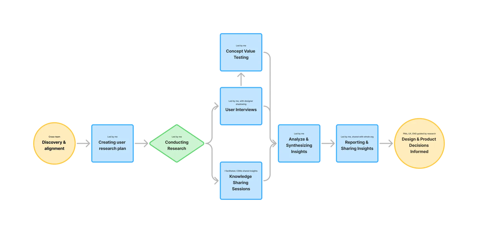
Steps 1 & 2. Discovery, Alignment & Research Plan
Reviewed existing PM notes and hypotheses about navigation, overview page, and documentation. Then held stakeholder interviews to capture their questions, and to understand their concerns.. Based on our meetings I created user research plan, and defined clear research goals with a focus on simplifying the overall user experience.
3. Conducting Research & Methodology
I chose a mixed method approach because no single method could capture the complexity of Edge’s usage.
User Interviews
During interviews, I spoke with a mix of experienced power users and first-time users. Power users showed me how they rely on Edge daily, while new users revealed where onboarding and discoverability completely broke down.
One of the clearest themes that emerged during user interviews was around the Overview Page. While it was originally designed to give users a starting point, both new and experienced users consistently told us it didn’t deliver real value.
Concept Value Testing
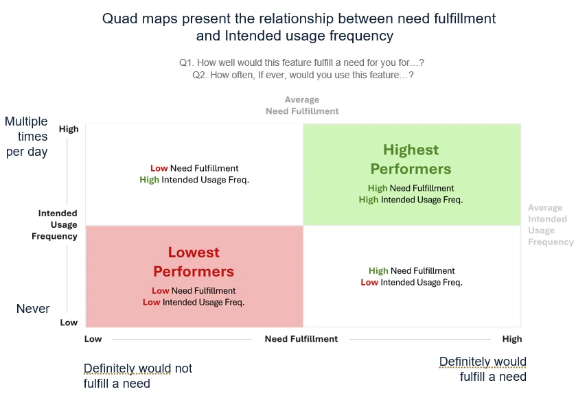
To take this insight further, I designed a Concept Value Test. After finishing the interviews, I sent a survey to all participants where we listed potential dashboard widgets (e.g., service health, traffic anomalies, active sites). Later w mapped responses into a quad map to visualize priorities.
- Critical health widgets ranked highest (high value + frequent use).
- Upgrade transparency widget ranked high in value, even if used less often.
- Vanity widgets (like top domains) landed lowest.
Overview page was
“nice to look at but useless,”
It became clear that users weren’t asking for a prettier overview — they wanted a proactive dashboard that told them, at a glance, if something was wrong and where to act.
4. Analyzing & Synthesizing
Research only matters if teams can act on it. I made sure the insights were clear, and prioritized:
- Affinity-mapped data into themes (navigation, overview, security, reporting, onboarding).
- Applied a severity scale to rank problems by impact (SEV 3 - delighter; SEV 0 - major issue)
- Reframed problems into “How might we…” opportunities for design.
5. Reporting & Knowledge Sharing
I delivered findings in multiple formats:
- A structured report with executive summary, quotes, and videos.
- Ran live readout with leadership team, ENG teams, PMs and designers, to connect insights to backlog decisions.
- Hosted, a knowledge-sharing session with CSMs, where I presented interview statements and they validated them against weekly customer conversations.
Outcomes & Shipped Changes
Overview Page → Proactive Dashboard
Simplified Service Flows
Other Proposed Improvements
- Breadcrumbs and split-views reduced context switching.
- Security tab should provide more transparency and clearer error messages.
- Reports should be redesign as whole, and users need more customization.
- Onboarding need more guided tutorials and contextual tooltips.